SM3713 Final Project
Chung Yik Ching 54414080
Final work
Art piece name: Missing
Written documentation
The whole world is in chaos with the ongoing Coronavirus (COVID-19) crisis spreading everywhere. There are now more than 4 million cases reported across almost 200 countries, resulting in almost 300 thousand deaths. For a long time, we haven’t faced a disaster as horrible as this, and I would like to create an artwork on this topic. My final project artwork is a visual art piece using Photoshop, combining a real photo and post-processing, which using the status of the Coronavirus in Hong Kong as the main theme to record the terrific atmosphere. The work was mainly inspired by the painting Music of the Sphere by Regina Valluzzi (in the powerpoint slide “Pythagoras the master”) for two different reasons. First is how the painting conceptualizes the scientific idea of Pythagoras and transforms it into a visual form in a subjective way. Second is the unique atmosphere and feeling by using different sharp colors and strokes, which reminds me of how coronavirus is now devouring the human race.
Because of the inspiration, I thought of creating a painting with a similar feeling. But at the same time, I will combine the theme of Coronavirus into the painting using data. I will use the data of infected cases as the main concept because I think that all of the data such as numbers and locations of infected cases on every day are actual representation of those people those are going through this horrible event, it’s a record of the disease and it can remind people that it happened. Why I chose visual art as the art form because I think that it can express emotions and also representing data in an innovative method, where viewers can see both in a single framing.
There are different artists that use data to create various kinds of artworks, including music, video, and installations. Such as Nathalie Miebach, that uses data to create 3D sculptures as a kind of data visualization. The different part of the sculpture actually represents different sections of the data. Jill Pelto is another artist the uses data visualization as art, but she also creates paintings. She draws watercolor paintings using different data of climate change such as rising sea levels and soaring temperatures to convey a serious message to the viewers.
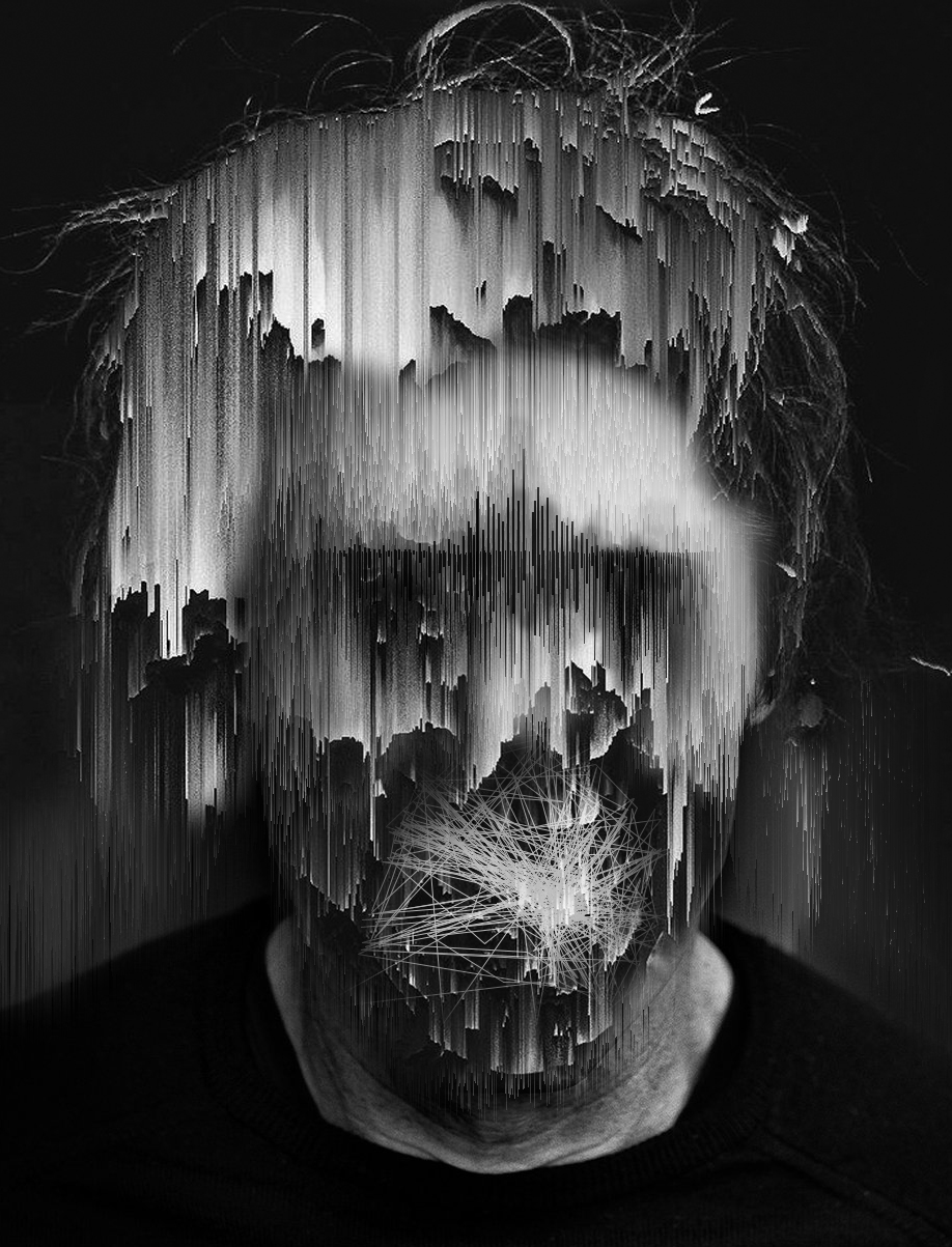
There are two main sets of data that are used and recorded in this work. The first one is the number of confirmed infected cases every day, from the middle of February to last week. I found the data before March and I started recording the numbers everyday since March. We can see a dramatic rise in numbers in March. But luckily the numbers dropped and it’s almost 3 weeks we don’t have a local confirmed case. The second one is the location of each infected cases. I marked dots on the Hong Kong map every day and then uses lines to connect each dot together in the order of time. So that the lines and dots will increase every day until the day I ended recording. At last, the result is like a spiderweb as shown in the mouth of the man in the painting. Also, I used the numbers of infected cases and turn them into a graph. The painting changed every day where the lines on his mouth increased every day like suturing on the rotted and broken mouth.
The first part of the work is to shoot a picture of a portrait. The background of the picture is a normal portrait of a middle-aged male. After that, I added a layer to cover up the original face and added the hair on the top. I created the distorted effect of the original pixel of the image to represent the rotted and corrupted person in the final product. I also make a hole in the bottom part of the work because the nose and mouth are the easiest way to get infected through this disease. The virus is like devouring us through our nose and mouth and to break us. After that, I added the dots everyday and connected them together. I also use the data of the numbers of infected each day to make it a graph, then I add it as the eyes of the face. The graph blends in with the other distorting pixels. The eyes and the mouth part represent different things.
At the proposal, I originally chose a green and blue color palette like the painting “Music of the Spheres” because it brings the atmosphere and vibe of the virus. But during the production, I think that black and white might suit more for the feeling of chaos. I think that the dark creepy mood of the art can represent the actual status and atmosphere going on currently in Hong Kong so that when the viewers look at the artwork, they can remember what happened at that time. By only looking at the graph or looking at the data, we might understand the objective information of the disease, but for some of the viewers, they might not actually feel what happened. But using art, we can capture the subjective emotion of it. Both data and art is trying to explain and represent abstract ideas. Through the artwork, I hope that people are reminded that some parts of us are missing forever after the virus, like the missing parts in the work, so that we can remember the sadness and lesson.
